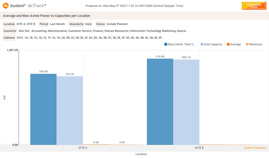
Shows 4 bars for each selected location. The Data Center totl as the location's power capacity, Sold Power Capacity as the sum of the cabinet capacities for the selected customer, average actual active power for the selected customer, period and granularity labeled 'Average' and the max actual active power for the selected customer, period and granularity labeled 'Maximum', . The actual values are based on available readings from PowerIQ.

Chart Widget - Average and Max Active Power vs Capacities per Location
Additional Info
- Date Created: Thursday, 19 June 2025
- Category: Power
Download attachments:
- AvgMaxActivePowerWLocationCapAndCabCap.zip (10 Downloads)
Image Gallery